Designing screens for Axiell Collections 1.11 and up

Contents
With release 1.11 of Axiell Collections, we have adopted a more web-friendly approach to detail screen layouts. We have an imperative to deliver interfaces that can be easily used by as many people as possible. We must accommodate those who use assistive devices to interact with software, those who cannot use a mouse, as well as those users with smaller displays who need more visual clarity to comfortably view and navigate through the application.
While we have tried to accommodate many possible or existing layouts, there will be some that just do not render well in a responsive web environment. These will need to be updated via the Screen editor in Designer using the guidance below.
What has changed
There have been several changes to the layout rendering – some obvious and others that are structural and “behind-the-scenes” to provide better support for screen readers.
Unique IDs enforced
For core software programming purposes, Axiell must ensure that the underlying IDs for fields and other key objects in the application are unique across the application to accommodate screen readers (software which reads screen contents out loud) and other assistive technologies. IDs for fields are dynamically generated based on the field name in combination with the screen id and the occurrence if the field repeats. This ensures that if the same field is configured to display on multiple screens, each instance can be uniquely identified.
Area labeling enforced
Navigable (using the Tab key) and actionable objects (which can be clicked) must have some sort of label so that screen readers can let the user know what the field is or what the action does. In cases where fields or buttons do not have visible text labels, the equivalent must be assigned as a property. Examples of this are the buttons in the menus or unlabeled fields.
Improved contrast
There are (WCAG standard) minimum requirements for contrast to improve readability. As of Collections 1.11, the application is delivered with visual styling that ensures the contrast requirements are met. This has been extended to field borders as well as text foreground and background.
Increased font size
The base font size is now 16px, which is in line with the WCAG accessibility recommendations.
Increased keyboard navigability
The editor is now navigable using the Tab key in read-only mode too, to enable those without a mouse to reach fields.
Responsive editor layout
Prior to Collections version 1.11, the layout of the screen tabs in the Record details view was based on calculating percentages of the fixed layouts produced in Designer. If the view was decreased in width by the user or screen size, the objects would shrink proportionally to their defined size. This was fine if the view could display as wide as the screens had originally been designed but became problematic quite quickly if not. With 1.11, we have implemented a “flex” layout which allows objects to wrap to the next line as the view is displayed narrower.
Decluttering
The box that is used to visually surround groups of fields in the layout has been transformed to a top line style to reduce visual clutter, so instead of a box, only a line above the field group is now visible, containing the box label.
Inherited values
Fields in Collections can be configured to inherit values from parent records. Prior to release 1.11, these fields displayed in light grey. Now inherited values display in black with a dotted underline.
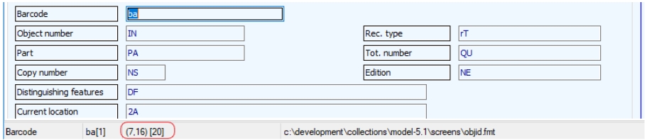
How the Record details view renderer interprets a screen design
The Designer Screen editor was originally meant to design screens for use with Adlib for Windows. Positioning in Adlib was based on a fixed character coordinate from the top and left (in left-to-right displays) of the screen edge. You can see this information in the status bar at the bottom of the Record editor window for a selected field of a screen in design mode. In the example below, the Barcode (ba) field is positioned 7 characters from the top, and 16 characters from the left, and is 20 characters wide.
While width is defined for fields, it is inferred for labels based on the distance of the label’s starting position from the next object it encounters in the same row (although labels associated with fields do have a maximum width of 11 rem, while free labels should respect the width given to them in the .fmt).
The renderer in 1.11 must take this fixed-position information and transform it into a structure and styling that is responsive to variations in width. As the display gets wider, fields will stretch and as it narrows, they will get smaller - down to the minimum calculated character size that has been defined in the form.
Character size calculations
The renderer transforms widths expressed in numbers of characters in the design into rems, which is the unit used by Collections to express relative size. Rem stands for “root em”. 1 rem is equivalent to the font size defined in the root (html) element. In 1.11, we have set the root font size to 16px – the recommended size for improved accessibility - so 1 rem in Collections is 16px. To calculate the number of rems from the number of characters in the screen design, multiply the number of characters by .65 to get the number or rems.
In the example above, the barcode field is defined to have a width of 20 characters (the number that appears in the square brackets). 20 characters x .65 = 13 rem.
So, does this mean that my field will display up to 13 characters in the browser? No, it will likely display more because not each character is 16 pixels wide, unless a fixed-width font like courier would be used. Here is an example (fixed width at the top):
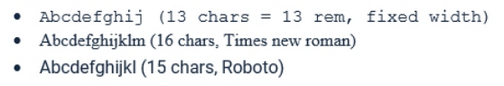
You can see that in the same 13 rem width, you may be able to fit a few more characters in with the variable-width fonts.
Form vs tabular layout
The renderer lays out fields based on the position of the label in relation to the field (if field and label are associated with each other). If the label is on the same line, the field will be rendered “form-style”, with the label alongside the field. If the label is on top, it will attempt a tabular layout. Mixing the two styles in the same row is not supported.
Not supported:

Because this results in:
If you want a tabular layout, you must ensure that all labels are positioned above their fields.
Handling empty space
The responsive renderer currently does not preserve extra spacing between fields. It will, however, include an end-of-row spacer (an empty space) if the row contains a gap at the end of the row.
For example:

In this case BA and AG are the same width and are placed with a gap in between. Because we have no way of telling the renderer which field should grow when the view gets wider, it splits the growth between the two and fills up the entire row:

Also note that label texts in front of fields are now right-aligned in the label box (instead of left-aligned as it used to be) to be closer to the data itself.
Adding a gap at the end of the row, will restrict the growth of any non-fixed length fields such a text fields (fixed length fields are ISO date, time and numerical fields):

Results in:
Leading empty space in front of labels or fields will be removed by the renderer.
The example below shows how the screen will transform as the Record details view is made or gets narrower (as other views are opened, for instance). This is the screen display when the view is wide:
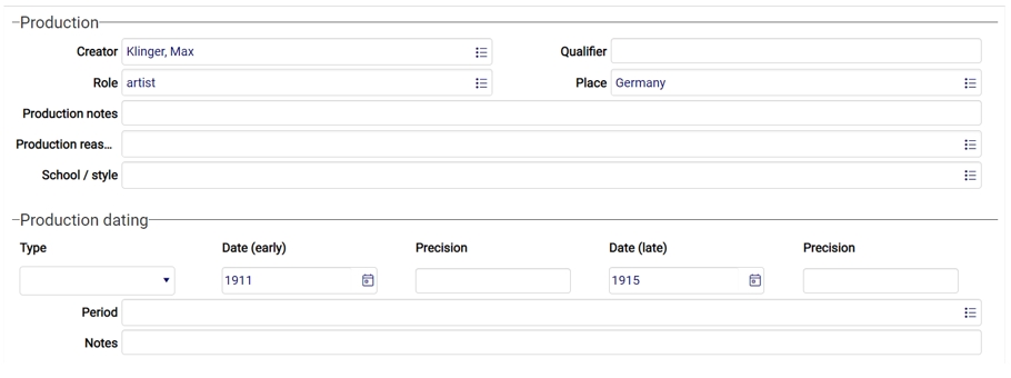
And this is the display of the same screen when the view is much narrower:
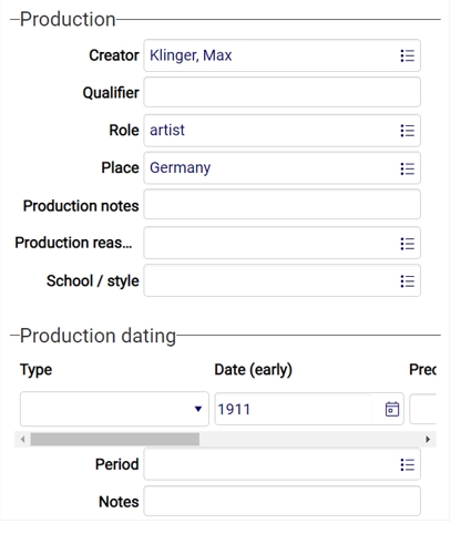
Note the Qualifier and Place fields (with labels in front of the fields) shift below, and vertically in line with, Creator and Role. The tabular Production dating field group (with labels above the fields) layout though, retains its base field sizing and displays a horizontal scrollbar to accommodate viewing and editing.
You can also see that labels in front of fields are right-justified and line up well vertically. This is possible because the renderer enforces the same fixed width for each label (if it is associated with a field). If the label widths were allowed to vary, the layout down the page would zig-zag.
You can control the fixed width of the labels – see the next section for more details on how.
In Collections 1.10.2 and earlier the same screen with the same data would be displayed as follows.

As you can see, it is not as easy to tell what the fields are by their partial labels and the data in the tabular layout is only partially visible too.
Screen design tips
Use informative labels
Do not assume that every person or assistive device sees and understands things the same way you do. When you are laying out fields on a screen it should be clear what each field is, and labels should be placed consistently (e.g., to the left of the field when not using a tabular layout). A Justification setting of Left or Centre should explicitly be set if you don't want text in labels to be justified to the right.
Ensure labels are associated with the correct field
Occasionally, a label may not be associated with a field on purpose or it may have become disassociated with its field. The latter can happen when a field’s label is inadvertently deleted, and then replaced with an insert > label action. Labels which are explicitly added to a form this way are considered stand-alone or orphaned labels and these may affect the layout of the screen negatively. Orphaned labels which have been placed next to each other may no longer be position above their intended fields when the renderer displays them, and when the view becomes so narrow that the line has to wrap, a label may end up positioned all the way to the right on the row above the row where the relevant is placed all the way on the left. When a label is associated with a field, they won't be torn apart like that.
Because of the challenges these orphaned labels pose, it has become more important to be able to find out which labels on which screens are such orphaned labels: normally when you place a field on a screen in design mode you get an associated label with it and for the new screen rendering it is important that labels are associated with a particular field as much as possible (although a well-placed stand-alone label doesn't always need to prove problematic), but Designer has also always allowed you to place just a label on a screen, so to be able to find those screens and labels easily now (from Designer 7.7.3.1790), screens with orphaned labels underneath a data source (not in the \screens folder though), are marked orange and if you open such a screen in the Screen editor the orphaned labels themselves are marked with an orange (containing text) or green (no text specified) border too.
If your screen with orphaned labels displays fine, it doesn't need changing of course, but if you find that display is problematic you could try adjusting the screen using the following considerations (do keep a backup of your original .fmt screen files):
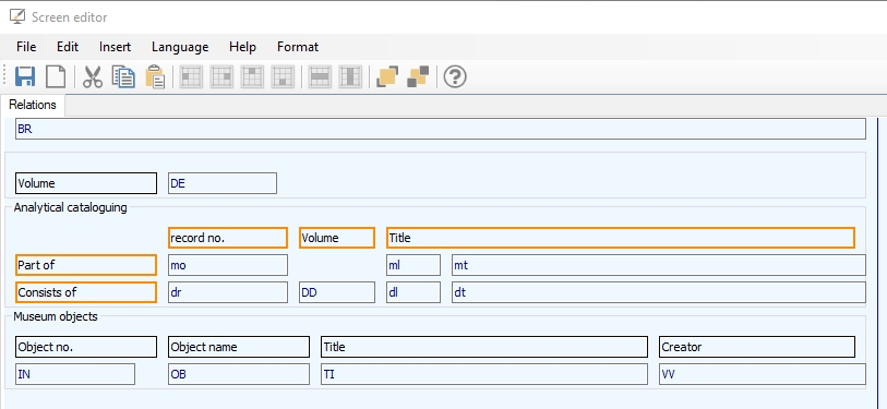
| • | From this version of Designer, an orphaned label can be associated with an orphaned field (saving you the work of having to create a new, identical field with associated label). Although an orphaned label now has an orange or green border in design mode, an orphaned field (a field without associated label) has no visual marking, but you can often guess the field if it has an orphaned label in front of it or above it. To be sure, select both an orphaned label and a presumed orphaned field which you think should belong together: do this by first clicking e.g. the label, then press the Ctrl key and click the desired field, although the other way around works fine too. Now right-click one of the two selected fields. If the pop-up menu shows an active Link label to field option, you have indeed selected both an orphaned field and an orphaned label. (The option won't be active if either or neither of the two fields is orphaned.)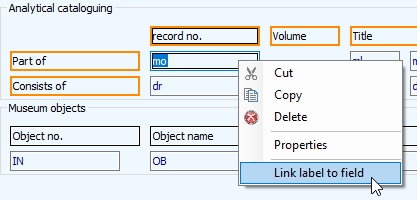 Click the Link label to field option to actually associate the label with the field. You'll notice that the relevant label no longer has an orange border because it is no longer orphaned. Save the screen to make the connection between label and field permanent. 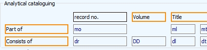 |
| • | If you have a situation like above, where the orphaned row labels cannot logically be associated with any field (because the column labels already have a claim on those), then you may need to consider a different solution. You could create a separate box for the Consists of field group for example. Then the first box can be named Part of and the second Consists of, while the second box can also have duplicates of the column labels from the first box. |
| • | If the solutions above are not suitable, you can also try to move the orphaned label to a different position to see if that helps in the display in Collections. If not, you can still delete a selected orphaned label via the right-click pop-up menu. Since it is a stand-alone label, no field will be deleted when you do that, only the label will be removed. Before deleting a stand-alone label consider the fact that it may have useful translations. You can copy those translations by right-clicking the label, selecting Properties, then right-clicking the translations list and selecting Copy texts in the pop-up menu. You can paste these copied texts into another label in the same way, but then choose Paste texts in the pop-up menu. |
Colours
The default background colour of displayed screens is now set to white. The renderer will ignore any background colors set in the Screen editor (for screens, labels as well as fields). Label text (foreground) colouring is honored, but you should ensure that the color that you choose meets accessibility requirements for contrast (https://webaim.org/resources/contrastchecker/). Other label font properties are ignored.
Decide on an appropriate label width
The renderer takes the width of the widest label that is associated with a field and applies that to all the in-line field labels* on the screen. Labels that are not associated with fields are ignored for this calculation on the basis that these are often explanatory/narrative texts that would typically be longer than field labels.
As a shortcut, remember the widest label wins, so if you want to increase the width of the labels regardless of the number of fields on the screen you only need to adjust one of them to the size you are after.
*An in-line field label is one that is displayed on the same row as its field.
Design for minimum field widths
Minimum field width is not an issue for rows that contain a single field (with or without a label). You only need to set a minimum width (by dragging the right side of the field in the Screen editor) when you have multiple fields in a row, and you want to control their wrapping behavior.
Except for date, time, and numeric fields which have fixed widths, fields will grow (and shrink) horizontally. With that in mind, a rule of thumb is to lay your fields out with minimum widths which will allow them to grow if space is available, but not to get any smaller than the size specified. In other words, decide how many characters must be viewable before the field wraps and is displayed on a new line, and ensure the field has that width via the Screen editor.
Recommended sizing for fixed-length fields
ISO Date, time, and numeric fields coupled with a label are fixed width. This means that the width that you assign the field in the screen layout is always honored - it will not grow or shrink – so you must be sure that you allocate the appropriate number of characters to it. It is important to include an extra character in each case to account for the icon that displays as part of the field for opening the date/time picker and the integer increment/decrement arrows.
Recommended character sizes (displayed in square brackets in the Screen editor) for fixed length fields:
• ISO Date: 13 characters
• Time: 11 characters
• Single digit numbers: 5 characters
Design for one label, multiple fields
There are cases where you may wish to have multiple fields grouped with a single label, like a title and its lead word for example. The example below shows a layout design of the future movement date and time fields.

Because there is no row-level display grouping mechanism for multiple fields in the Screen editor, you must use a workaround to achieve what you are after. The renderer is designed to wrap the label and all the objects between it and its associated field together. We can use that behavior to achieve what we want.
| 1. | Create the trailing field (in this case 2P) and keep its label. |
| 2. | Now create another field that you want grouped (in this case mP), delete its label, and place it between the label and the field that is associated with the label. |
| 3. | Now give the field associated with the label (2P) a sum length of the minimum desired widths of all the contained fields. |
Using the case above, ISO dates have a recommended width of 13 characters, and time fields have a recommended width of 11 characters. Add those together and set 2P field’s width to 24 characters or a little more to ensure the date and time fields can fully display their field values. Here is the result:

Having to use a work-around is not ideal, but it does work, and it will likely be replaced in the future by a better layout mechanism.
Designing tabular layouts
There are two styles of tabular layouts for field groups in Collections:
| • | the first one is the traditional “Adlib-style” tabular layout with multiple fields in a single row, which places all the occurrences of that field group in rows beneath it, with the labels above the first row. This layout is enabled by placing the desired fields in a single row with each associated field label next to each other in the row above them. An example of this design style: which is rendered like the following:  There are times when the number of fields desired in such a column layout would result in a display that is wider than the Record details view width. In these cases, a horizontal scrollbar will be displayed directly underneath the field group. |
| • | the second one utilizes a user-resizable table grid component which is the recommende style for field groups where you potentially have large numbers of rows. Of a horizontally oriented field group (fields placed next to each other), you may consider placing it in a box without other fields in it, turning it into a table grid by right-clicking the box, selecting Properties in the pop-up menu and marking the Edit link group on demand option for it. A table grid has significant performance advantages when the field group has a great number of occurrences. If the box contains just a single field, assign it a field group name in the .inf too, otherwise the table grid won't display. If you have to move any other fields out of the current box because they are not part of the field group meant for the table grid display, then do that by cutting the fields via the right-click pop-up menu (which also cuts the associated label), then pasting them in an empty area at the bottom or on the side of the screen and then dragging them - the label first, then the field, otherwise the label may disappear on you - to their new box or location. |
List screens (aka brief display screens) determine which fields/columns will be shown in the Result set (and other record list windows) the first time a user opens Collections or after a reset of the user settings.
For Collections, a brief display screen can simply be specified by a single row of entry fields, each with some field tag.
Any linked or separate field labels will be ignored: column header texts in the current user interface language will be taken from the Screen texts property on the User interface texts tab for the relevant field definition in the .inf or, if those texts haven't been specified, from the Field names property on the Field properties tab for the relevant field definition in the .inf.
To get a column of image thumbnails in the Result set when it first displays, in design mode of the screen you can simply insert a normal entry field with the relevant reproduction reference tag on the screen. Image screen objects associated with an image field can also be used instead of a normal entry field, but it will still be represented by a thumbnail column in the Result set. If there's no field with the reproduction reference tag of the list screen, then the user can always select the image field from the Result set settings dialog to still display thumbnails.
An Image screen object is still required if you'd like a format string set up for the image field in the data dictionary to display some other record data instead of just the record number underneath images displayed in the Gallery view.
On existing screens you may still find remnants from the Adlib past, but those will all be ignored by Collections. Menu option screen objects (a.k.a. checkboxes) were used in Adlib, but are ignored in Collections: the Result set view in Collections comes included with checkboxes. You may also find so-called system fields: in Adlib, system fields (indicated by reserved tags *A, *B, *C etc.) could be used on brief display screens to concatenate data from fields and fixed (separator) texts, but they are ignored by Collections.